
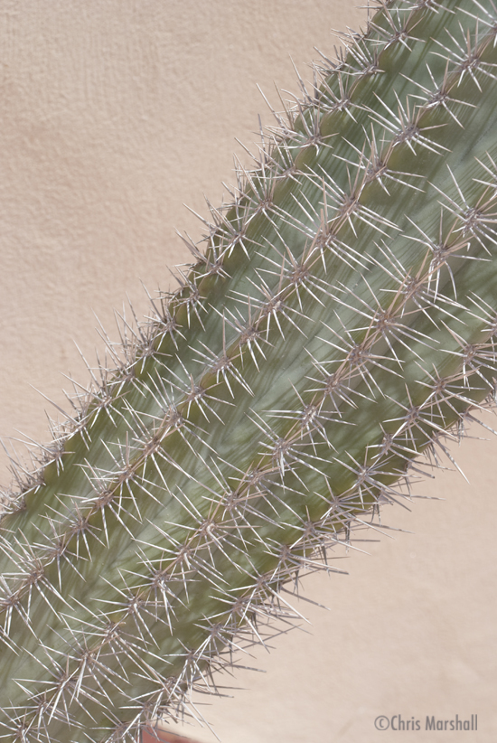
There is a little ‘history’ to this picture.
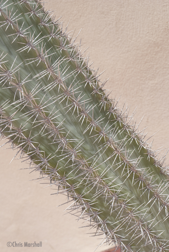
Last week’s picture got some really constructive comments, not least from Gary who explained the ‘left to right’ theory of presenting a picture in terms of ease on the eye. He suggested that I presented a picture in ‘left to right’ and ‘right to left’ to test out the theory, so I have done (see below).
As for the reason behind the Cacti, well Mac has taken such great close up pictures over on our 4frames project site that I thought I better do one as well!
This is a slightly strange choice for a desktop I know, but I really like the colours and shades on the thorns, and to be honest it was the only real option that I had available to hand. The actual cacti is huge and has sort of become my pride and joy up on our roof.
Gary – thanks for the idea, as ever I look forward to your comments!
Here is the ‘right to left’ version:
In my view gary was correct – amazingly so! Not that I doubted Gary, just that I hadn’t realised just how much easier on the eye the ‘left to right’ is.
What do you think?
Hi Chris
I’m not sure I like the squashed format you’re displaying it in here – sorry. Still, I don’t have the personal connection with the subject that you do, so I “see” the image differently. (For anyone puzzled about what I’m talking about, right-click the image and view it in its own window… Chris – feel free to remove this last line if you’re not happy with the suggestion. 🙂 )
Leaving that aside, three things spring to mind.
1) The remnant of the rim of the pot about a third of the way along the bottom of the image is slightly distracting. Slightly tighter cropping would easily solve that.
2) The image is kinda flat. Dull. Technically, it’s a low(ish) contrast image. Using the image editing tool of your choice (I seem to recall that you favour Aperture – Me? I’m still a Photoshop user) bring up a Levels dialog box. You’ll see the histogram has nothing in the lower (black) range of values. Drag the black point to at least the low 40’s. You could even go as far as about 60 and not lose anything. This will produce a more realistic image… (IMHO!)
For the benefit of anyone who has not previously tinkered too much with levels – or doesn’t understand them too well – I did a quick Google and came up with this page which looks like it gives a reasonable explanation…
3) Once you’ve set the levels, you could apply a little gentle sharpening too – but don’t get carried away and introduce sharpening artefacts…
Having said all this – I’m talking about improving the photo in a general sense. On the odd occasions that I use a photo for my desktop, I don’t like anything too contrasty – it becomes distracting when trying to locate that important file you know you left lying on the Desktop… Horses for courses – and all that!
No problems with the comment – the picture is squashed in order to ‘fit’ the site dimensions, but purely to demonstrate the point of the exercise regards viewing.
1. Agree – but again in ‘defense’ wasn’t really concentrating on the quality as much as finding a way to ‘test’ the theory.
2. I use Photoshop (just not very well)and actually added a layer to make it look like it did 🙂 Was just ‘playing’ around. I need to learn a lot more. This was a pretty useful guide to understanding histograms though (http://digital-photography-school.com/blog/understanding-histograms/)
3. Good advice – as always.
I change my picture every week. Sometimes I end up with one that can make it somewhat difficult to use the desktop, but at the moment I am experimenting and learning. I love what Photoshop can do but at the moment anything above the basics takes me a long time. Again, this is something I am having to adjust to – taking time over photographs after I have taken them.
I find your comments very very helpful, keep them coming, and I promise I will get better 🙂
Great comments. Weird about the forced landscape mode. I do like the cactus “grains.”
What I find interesting about this photo is that it looks more of a painting than a photo, that was my first impression. The grain in the cacti is especially interesting. I can’t say that I like it, but it’s an interesting concept.
Fair enough – but don’t forget the real objective was to test the ‘left to right’ theory 🙂
Which way do you find easier on the eye?
Of course “left-to-right” one :). I don’t want to offend you, just my personal opinion. I don’t hate the picture, but I just don’t find it appealing. It’s a very good example of prooving the point. Now this left to right theory raises an interesting concept thought. The western society reads left-to-right, and top-to-bottom. Now Asian specially Japanese people read somewhat different. I’m curious if this rule still applies, or am I totally going off the wall? Thoughts?
No offense taken 🙂 It actually does look better if you view it in its ‘proper’ format.
I have the same question regards left and right handed people. I have a theory that it is easier to move your hand away from the body so right to left forright hand people and lefty to right for right handed people.
I’m not sure the left/right handedness issue is relevant to the eastern reading/writing from right to left. For your theory to be true, wouldn’t that imply that because the Japanese writing (and possibly others from the East) goes from right to left that the vast majority of Japanese people are left-handed? (Surely they’d need to be for that style of writing to have become dominant?)
While it’s true I just glanced down the page, there appears to be no indication at Wikipedia in this left-handed article that this is true.
Having said all that, I know nothing at all about how they would react to the the left/right versus right/left photographic composition technique.
Since I raised it in the first instance, I should admit that I don’t know if there’s a name for the technique/style/whatever, so I can’t easily research it on the web. All I know is that I “learned” about it over 20 years ago.
Your post raises some interesting questions. I did a quick search and according to the Japanese there are only about 2% of population that is left handed, or admits they are. Their writing is also completely different than ours. They also read differently they we do. It’s the reading that I’m curious about. Since we read left to right top to bottom, our eyes are “trained” to follow this pattern. When we look at pictures we are “reading” them. Now since easter cultures do not read like we do, they are “trained” differently. Now we need a person who can answer this dilema. Back to Google.